Why is a mood tracker from 2016 still the best?

In 2016 I built MoodApp, a mood tracker designed to solve my own misery. I became convinced that my job was horrible, and that I was miserable because of that job. Maybe all I needed to be happy was to find a new job? But what if I was wrong? Spoiler, I was wrong. What if there was an alternative cause, and data collection and analysis could show me where the actual problem lay?
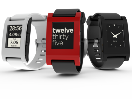
To this day I believe the buttons on the side of the Pebble Smartwatch combined with the ability to have a persistently foregrounded app provided me with the user experience (UX) platform to build the best mood tracker I ever used.
Why Mood tracking matters
Before we get into UX and buttons, it is important to understand why mood tracking matters, and how that will influence an optimal mood tracker design.
There are specialized use cases such as tracking mood during clinical trials out there. However, most individuals I spoke to only cared about mood tracking if they had an acute problem they wanted to fix. I could relate to those people because in building MoodApp, I was trying to solve my own misery.
The holy grail of mood tracking would be a system which automatically detected and logged emotions to be analyzed at a later date. Considering that we can't even do this in a lab setting, let's keep it in mind as an ideal, but focus on reality. By 2015, there were plenty of mood trackers that existed on the market. Everything from apps on a smartphone, to websites, to ye olde pen and paper. The problem with all of them (and the still unsolved problem today) is how do you get yourself or a user to submit data into the system. The term medical adherence describes the challenge here.
The TL;DR is that people don't do what is in their best interest. They don't take pills their doctor tells them to take, they don't floss when the dentist tells them to do this, and they definitely don't take out a pen and paper in the midst of a heated conversation with their manager to log their feelings.
What we have today
The world has wildly changed since 2015, except not in the realm of mood tracking. There have been a couple new entrants to the space in the form of apps that run on smart watches (but are functionality identical to smartphone apps), some dedicated devices of questionable accuracy, value, and with varying privacy implications (Halo was shut down), or hybrid approaches like fitbit's Stress feature. Apple's upcoming iOS 17 update will allow users to "log their daily moods and momentary emotions; see what might be contributing to their state of mind" but we have yet to see how that is implemented. Ultimately, none of them try and solve the adherence issues and fail to move the needle for capturing a meaningful amount of data to help a user effect change in their lives.
The tracker I use today for ongoing mood monitoring is how we feel. The main improvement between theirs and most others is that they have something akin to an emotion wheel as their primary design element:
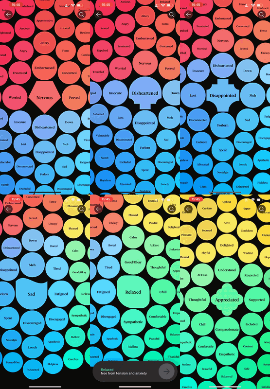
This UX is important in helping users learn the vocabulary to better identify their emotions and thereby empowering them to deal with those emotions. However, the main functionality to improve adherence is a simple scheduled reminder, which if you pay attention can be configured with some degree of variability (though for some reason this isn't the default). This was something other apps, and even MoodApp had in 2016.
The thing that how we feel offers that MoodApp never did is the ability to tag what you're doing, and who you're with. It also integrates with Apple Health (fitness and sleep) and the weather to see if there are any correlations there.
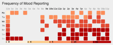
Unfortunately, without adherence, there is little data to analyze:
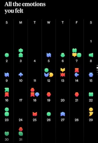
Things haven't gotten better, not because of laziness, stupidity, or malice of those working on the problem. It is because input methods to support adherence haven't changed.
Why buttons + foreground apps
In the ideal of mood tracking mentioned above, the word automatically does a lot of the heavy lifting. What it is really saying is that we want to understand what you feel, when do you feel it, where you are when you feel it, and any additional metadata we can get related to the emotion.
We can't record everything, but physical buttons and a foregrounded mood tracker go a long way to solving the problem because they make it easy to log your feelings anywhere, anytime, no matter what is happening. This is because tactile buttons on the side of a smartwatch can be operated by the user in nearly any setting without looking at the screen.
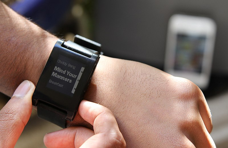
By using the up button to signify a single unit of positive emotion, and the down button to signify a single unit of negative emotion, the user is empowered to log emotions effortlessly, without making others aware that they are doing this.
For example, in a meeting you can press the buttons under a desk even in the middle of a high stress situation. Or, at an opera where you're absolutely loving the performance you can press a button without lighting up a screen and disrupting others.
Without buttons that work without you looking at them, this kind of input is simply not possible. For example, the Digital Crown on an Apple Watch could in theory be a great input. However, it can't be bound to a random app that is always open, and it's hard to know how far you have rotated it without looking for some kind of visual feedback from the watch.
This didn't fit elsewhere, but a random note I wanted to include was that a nice unintended consequence of allowing a user to log emotions whenever they wanted was that it empowered them to ask themselves how they were feeling more often. Awareness of your current emotional state is an important component in emotional regulation and behavior modification.
What I learnt about my mood
Since MoodApp generated significantly more data points per day (I could easily log more than 10 times a day) we could apply standard data analysis methods to it.
I found that there were a couple main analysis approaches that helped me understand my own issues. The first was understanding if there was a correlation between mood and location. This was easily identified using a heat map of my emotion logs.
Looking at this map, it was trivial for me to understand that the workplace was not the cause of my negative feelings. In fact, the location with the small amount of red on the map near where it says South of Market was my workplace and was the only place where I regularly felt positive emotions. The blue dots which signify negative emotions are by Union Square and by DNA Lounge may be easy to recognize for SF locals, but if not, these are the locations of nightclubs.
Another way to analyze this data is by looking at it in relation to time. I broke it down like so:
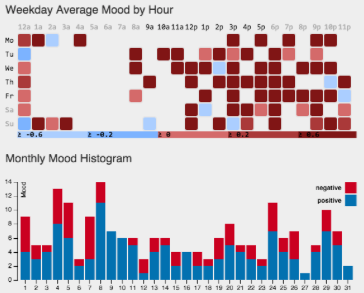
Apologies for the inconsistent colors here. In the first graph, blue is negative emotion and red is positive. In the second graph it is reversed. Anyways, this helped me to understand that most of the negative feelings I had came at 10pm or later. This was correlated to the days of the weeks I was going clubbing. Not that surprising that I found out that alcohol actually made me less happy, not more.
Conclusion
I am in a much better place in my life today, and how we feel meets my needs. But if I were dealing with an acute mood issue and needed a tracking tool which supported a high degree of data logging, I don't know of any options on the market.
To this day, I am not aware of any major platform (smart watch / wrist band / ring / etc) that supports similar enough UX to build a new version of MoodApp. There are some indie platforms out there like Paul Smith's Open Smartwatch, or the mutantW_V1 which I think can be used for this use case, but are not at a point of developer experience where they are a viable developer platform for distributing a mood tracking application. If you know of a good platform I have overlooked, please let me know. If someone at Apple, Whoop, Fitbit, or similar is reading and wants to know more, please give me a ping and I will be happy to share more info with you.
Credits:
Images were provided under Creative Commons by Pebble Technology.